No Comply
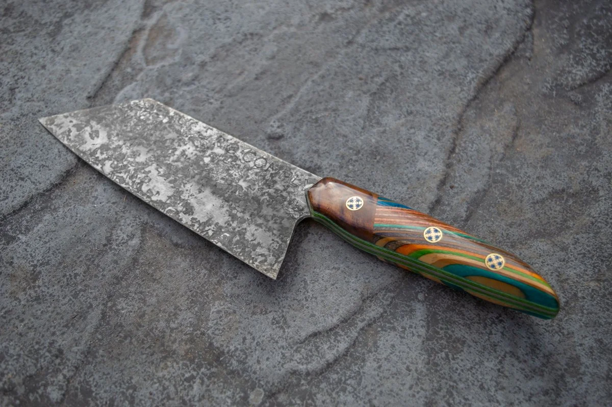
No Comply is an independent design-led brand I co-founded, creating handcrafted homeware from broken skateboards and reclaimed timber.
The challenge was to develop a visual identity that could communicate the brand’s connection to skate culture, while appealing to a broader audience. The identity needed to balance the raw, DIY origins of the materials with a more refined design approach, creating a brand that feels authentic and recognisable across a growing range of products.
To see more, visit nocomplydesign.com
Brand Identity & Logo Design
Art Direction & Photography
Printed Collateral
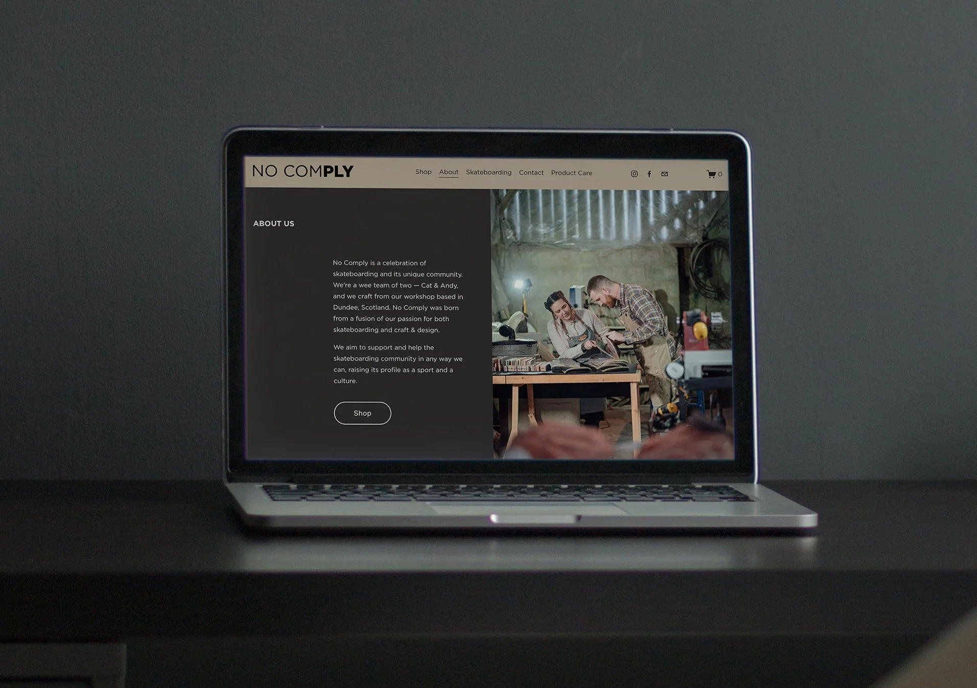
Website Design

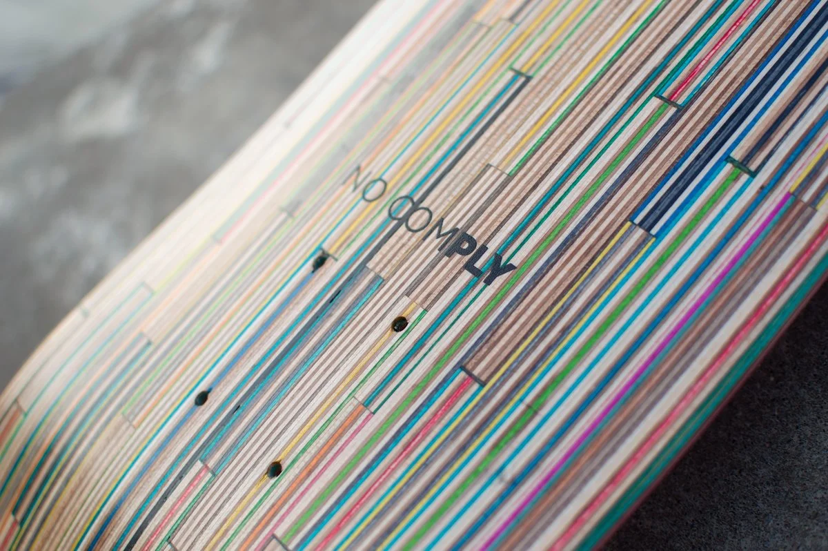
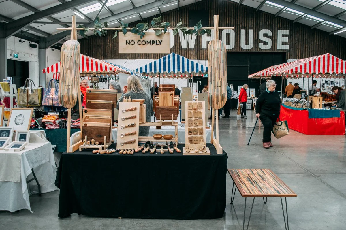

The name itself is derived from the no comply skateboard trick – one that challenges convention. The identity builds on this idea of doing things differently, while also drawing inspiration from the material at the heart of the brand: skateboard decks are made from layers of maple plywood.
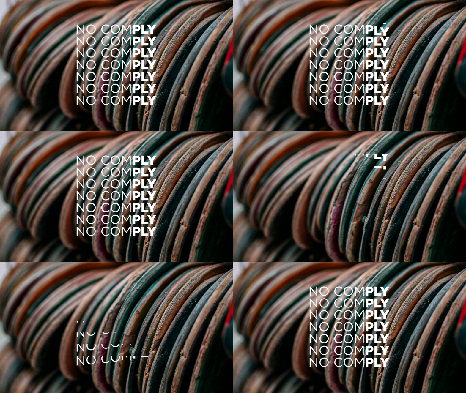
The wordmark places emphasis on PLY, highlighting the layered construction of the skateboard and creating a subtle connection between the name and the material.
Rather than relying on typical sustainability brand visuals, the identity was designed to let the materials tell the story. The reclaimed skateboards are naturally vibrant and unique, so the brand system uses colour sparingly, creating a neutral framework that allows the products to become the focal point.

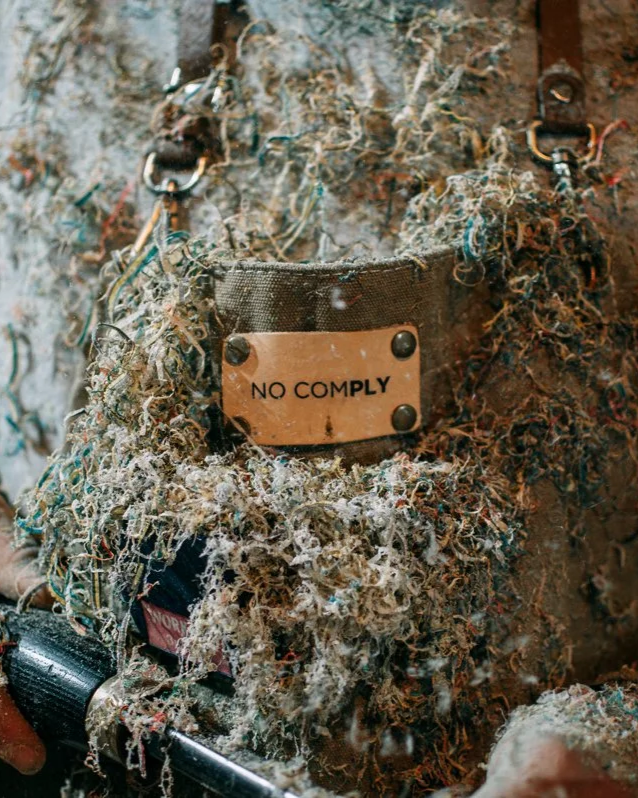
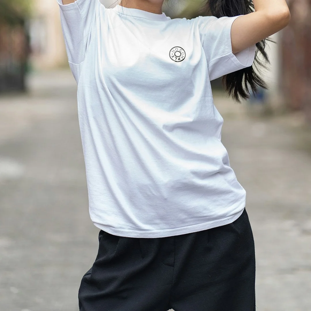
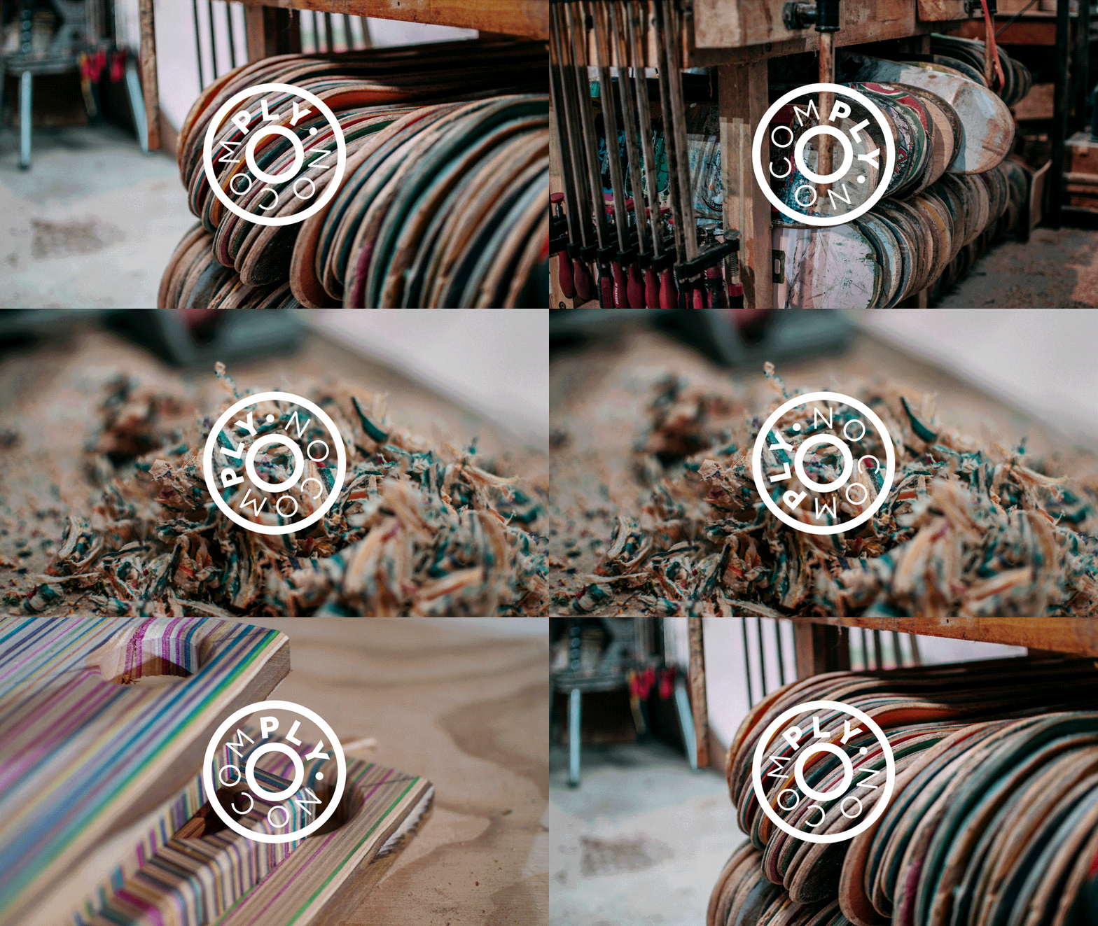
The core identity consists of a bold wordmark alongside a circular badge format. The roundel references the shape of a skateboard wheel bearing, creating a secondary mark that connects directly back to skate hardware while providing a more adaptable graphic device for smaller applications.
The identity was designed to shift depending on context. The wordmark provides brand presence across larger formats, while the roundel offers a compact mark suited to stickers, social media and merchandise.
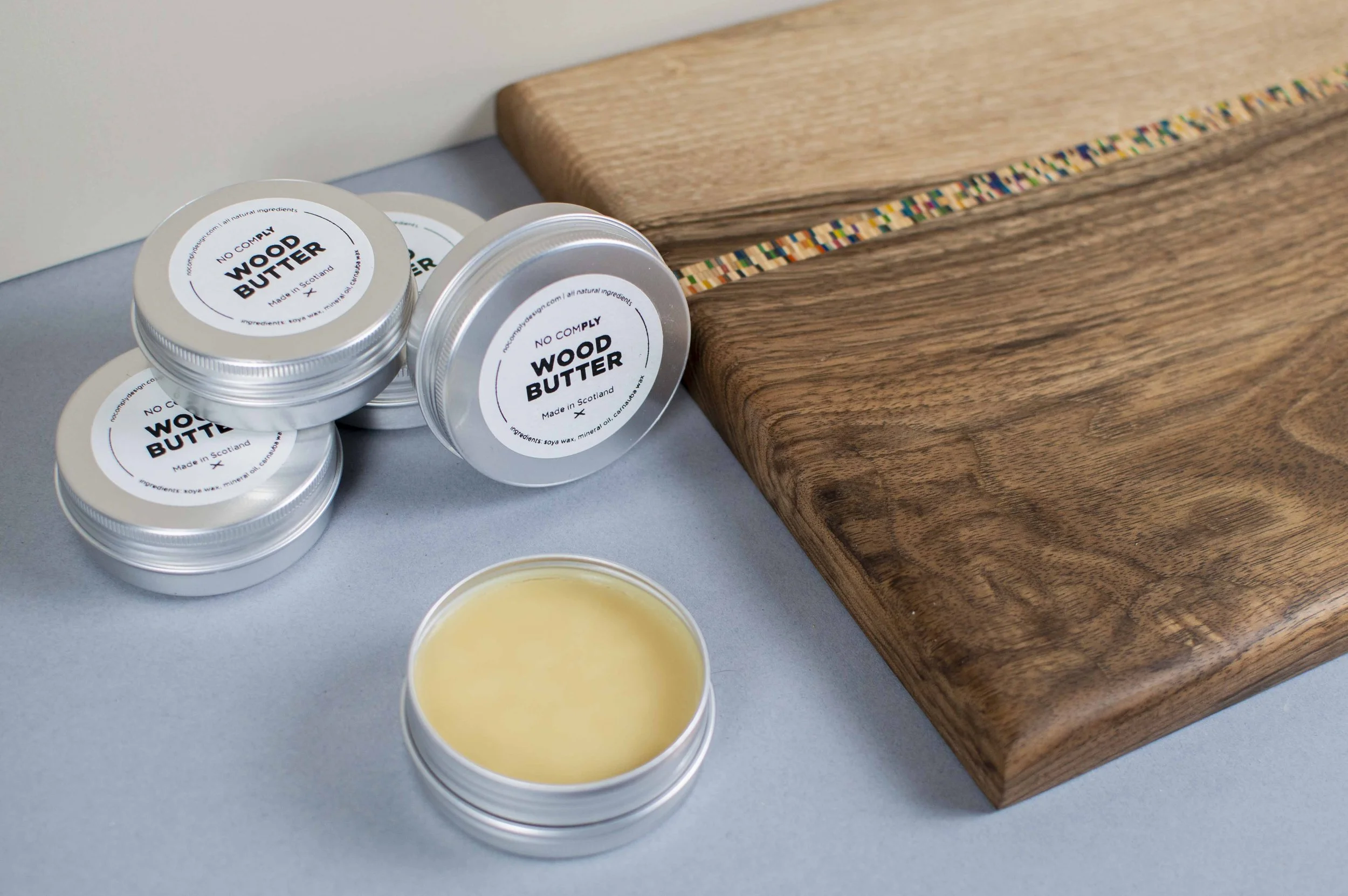
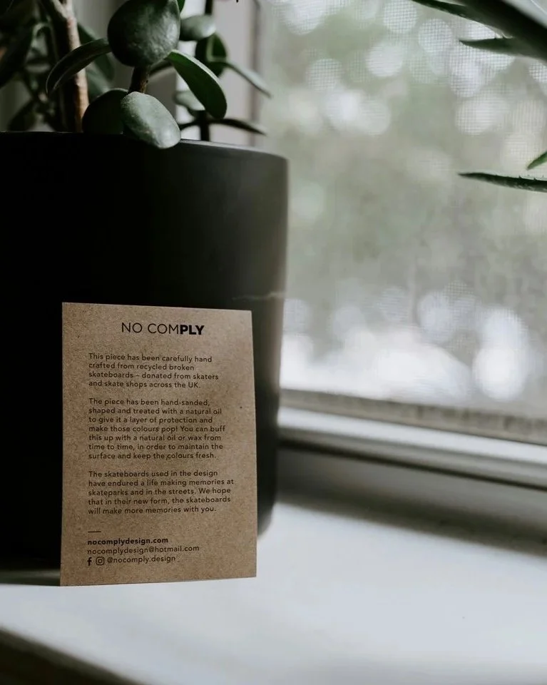
Material choices were also considered as part of the wider identity. Kraft stock was selected for printed collateral and packaging due to its tactile, natural qualities and its connection to the handmade nature of the products.